How Our WordPress Website and Branding Skills Tuned Into Friend MTS Technology
Friend MTS provides content protection services to pay-TV operators, rights-holders and broadcasters. The company offers innovative solutions that protect live and non-live content across broadcast and OTT (Over-the Top media services).
In short, thanks to Friend MTS’ technology, the company’s clients can trace unauthorised live-streaming leaks and channel-feeds prior to terminating these illegal connections.
Communicating Character
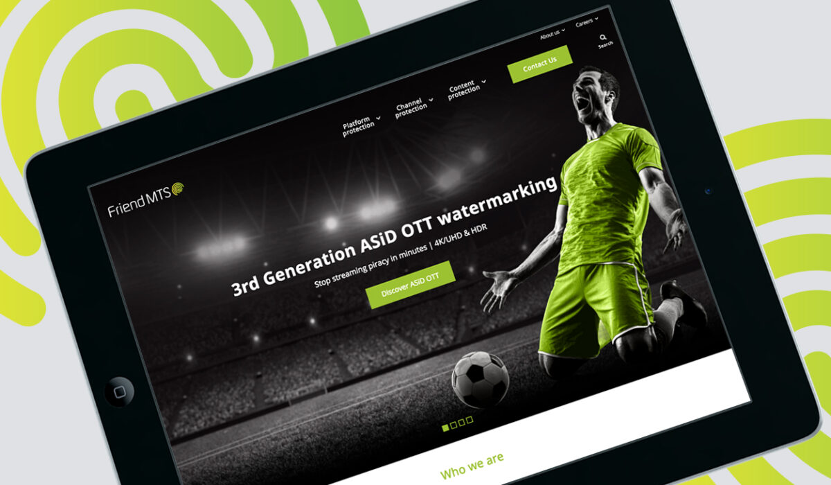
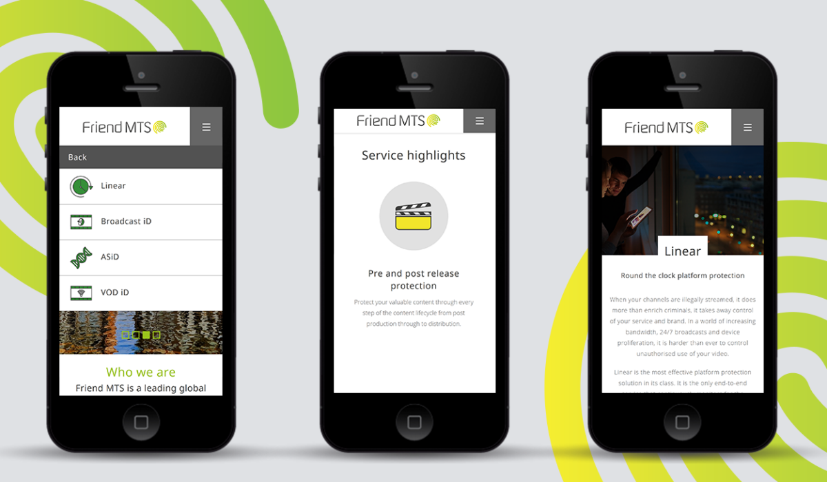
Friend MTS asked Hookson firstly to completely update the company’s branding, and then to apply the brand to a new Hookson-designed website.
Values-Led Branding
For technology buyers, the new brand would need to evoke innovation, relevance and the core Friend MTS characteristics of trust, value and quality. Across our branding and website design we would convey expertise, solutions and, via careful application of UX, invite engagement.
By building the new website on WordPress we would be utilising a world-class platform. From this base we would customise the site and allow our new branding to shine.
Building a New Brand
We rooted our brand positioning for Friend MTS in a passion for new ideas, innovation and technology. Distilling this, a new logo – a modernised, fingerprint-inspired design – reflected a flagship offering.
Enabling Outstanding Stand-out
Despite occupying a unique position in its sector – one with few competitors – it remained important that Friend MTS secured stand-out in the constantly shifting technology landscape. To this end, alignment would be everything. So, moving beyond online and digital, we would apply our new branding design across the organisation. Right down to signage and uniforms.