A Work of Art: A Dynamic Auction House Website for Gorringe’s
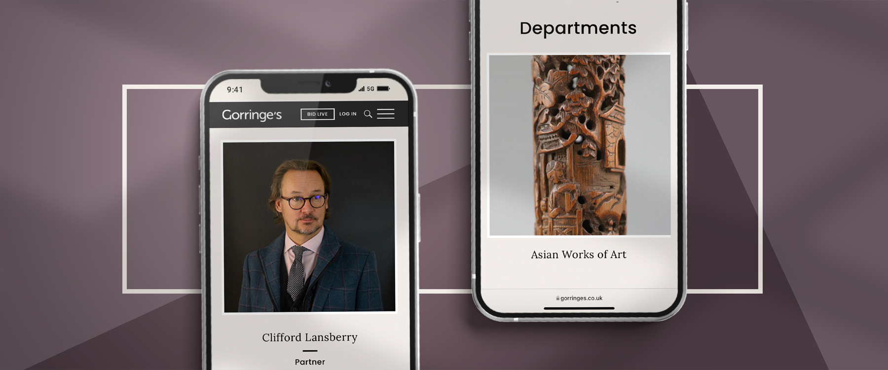
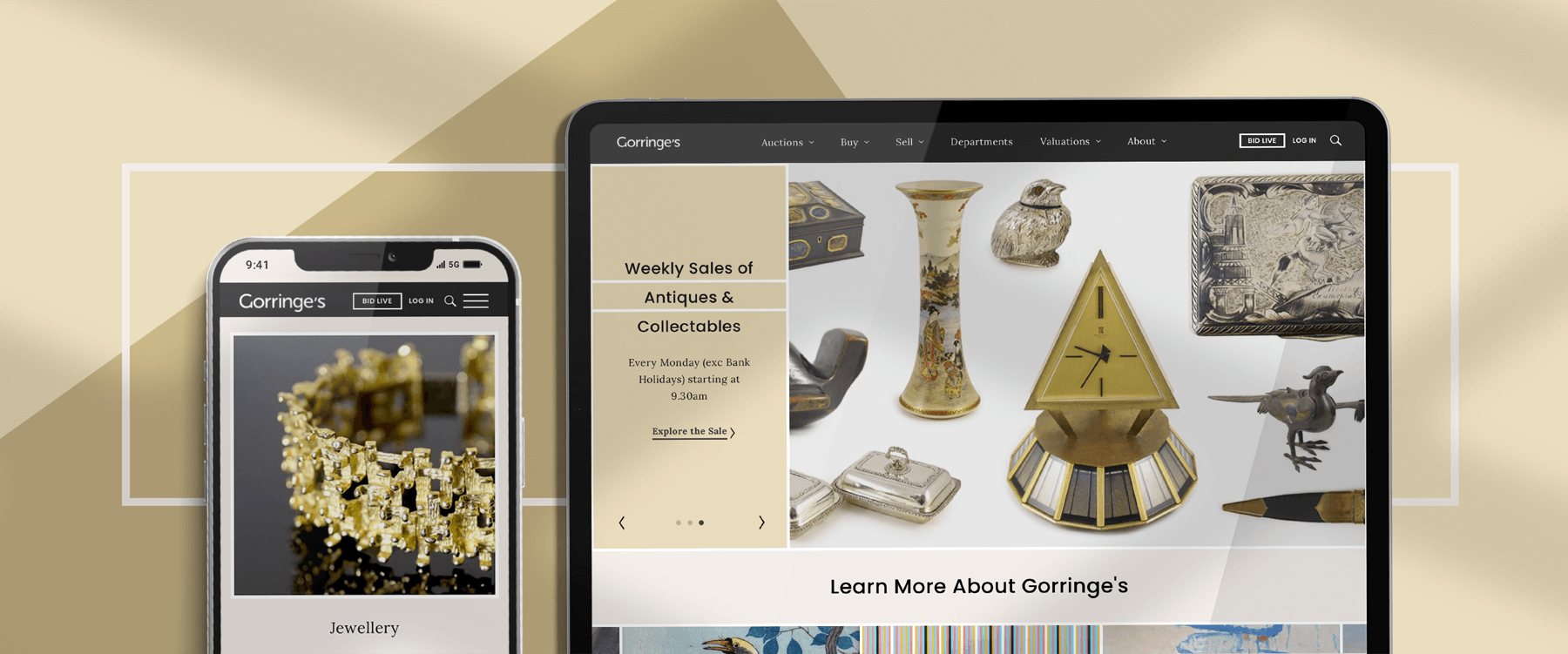
Gorringe’s is an English auction house specialising in fine art and antiques, as well as the sale of valued collectables including books & manuscripts, ceramics & glass, and musical instruments. The firm, based in Lewes, East Sussex, began trading in 1929. Today it holds regular auctions in addition to offering expert-led valuation services.
Prior to this project, Hookson had significantly redeveloped the Gorringe’s website. Our work had greatly enhanced UX via the addition of a potent catalogue search and the integration of market-leading auction software. And for maximum flexibility we had built the new website on the Drupal framework.
When the time came to add even more functionality, and to create a brand-new design, we were eager to start.
Our site-planning and content inventory activities began with a full site audit.
Driving the online functionality a busy auction house would aspire to, we would again be integrating a best-in-class auction software system into the Drupal content management platform.
Drupal: Building on a Solid Foundation
On the back-end, Drupal remained a terrific choice for the new Gorringe’s website.
Across our initial build its flexibility had allowed Hookson’s designers to work alongside the existing site. In practical terms, this meant we could add significant functionality whilst retaining the site’s structure, look and feel, as requested.
Now, as we approached this major new design, Drupal would serve us well again.