Designing for Digital Accessibility – Let’s Create Engaging Experiences for All

Try out Hookson’s Reliable Tips for Ensuring You’re Wowing Every User

Designing for digital accessibility might sound like a heck of a task. But in this Hookson blog we’ll show that accessible design – for new and existing websites, across apps and e-commerce – needn’t be a headache.

We’ll also demonstrate that opening up digital experiences to all is a terrific move for every customer and every organisation.

Welcoming Every User, Every Time

Since its inception, the internet has been a disrupter. A force that, at its best, has changed for the better the way we browse and buy. How we chat and stay in touch. And how we keep ourselves entertained and informed.

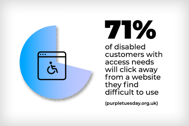
Those online experiences – as well as everything else that digital innovations offer on our phones, tablets and computers – should be available to every user regardless of any disability they live with.

And it’s this goal that’s at the core of designing for website and digital accessibility.

It’s a process that’s all about making people’s digital experiences fantastic, intuitive, seamless and, above all, accessible.

By designing with accessibility front and centre you can ensure your website, app – indeed every digital asset – welcomes every user every time. That’s not only great news for your browsers, it makes solid business sense too. After all, you want to engage with as many customers as possible.

As a Digital Marketer, How to do it, Though?

Across this blog, we’ll be sharing some terrific tips and tools to help get your website and wider digital offerings accessibility-friendly. But first up, let’s look a little further at what designing for digital accessibility means.

Designing for Digital Accessibility: Designing for Democracy

Designing for digital accessibility means designing for the broadest possible audience. It’s about providing the best, most interactive and user-focused digital experience to every visitor. It’s about anticipating accessibility challenges and meeting them head-on.

Smart website and app designers are on top of this, and are harnessing technologies and tools that deliver first-rate UX, UI and functionality.

Often these innovations enhance the experience for all visitors, not only users with disabilities. The use of contrasting colours, for example, improves clarity for those both with and without a visual impairment. Similarly, attention paid to typeface legibility is a winner for everyone.

Accessible dgital design enhances UX, lengthens reach and boosts reputation. It’s a genuine win-win for all visitors and every business that takes the initiative.

Which Accessibility Challenges do Designers Face Down?

The list of challenges and conditions is long. But for a general picture, website, app and digital designers reaching for accessibility will take into account disabilities including:

  • Cognitive disabilities – like dyslexia and dementia
  • Hearing impairments – users may be totally or partially unable to hear
  • Photosensitive seizures – flashing lights can trigger seizures in visitors
  • Physical disabilities and motor skills – challenges in moving parts of the body can make it difficult for visitors to operate a keyboard or mouse
  • Visual impairments – from total or partial inability to see, to the issue of colour blindness

Accessible Digital Design: Linking with Assistive Technologies

Users affected by any of these conditions often rely on assistive technologies. Across both hardware and software these include adapted keyboards, Braille terminals, screen readers and speech recognition software.

At the creation or redesign stage of every digital application, the opportunity is there to couple these technologies with thoughtful design features. Features that utilise these innovations to prioritise accessibility.

The end result? Ensuring your website and all of your digital offerings are accessible is a genuine win-win for all users and every business that takes the initiative.

For users? A quantum leap in usability, as thoughtful digital design begins immediately impacting UX and UI.

For your organisation? Aside from demonstrating customer care, there’s the competitive edge accessibility can bring. There’s increased reach too. Legal compliance. A higher SEO score. And a boost to brand reputation.

Now let’s look at some solid, benefits-driven tips around designing for digital accessibility.

Alt Text: Tell a Thousand Pictures with Your Words

Alt text is short descriptive text designers use to describe an online image. It’s part of the code belonging to the snap.

Providing alt text ensures that technologies like screen readers will describe an image to a user who might be visually-impaired. So a beautiful waterfall at dawn will be expressed as such, rather than a user’s screen reader offering a soul-destroying file-name like image363.

Accessible to Everyone

Images especially important to your page – a product shot on your e-commerce website for example – are important to all users, so they should be accessible to everyone. Related to this, where videos appear on your website, consider subtitling spoken words and employing audio description.

Managing alt text is one of the easiest and most thoughtful contributions designers can make to website accessibility.

The creation or redesign stages bring opportunities to couple technology with thoughtful design features prioritising accessibility.

Keyboard-Only: the Key to Website Accessibility

In an online world of swiping and pinching, and of powerful mobiles and tablets, it’s tempting to regard the keyboard as something belonging to another era. But truly accessible sites can be navigated and experienced via a keyboard only. That’s because the keyboard is the principal tool used by many assistive technologies.

A user’s keyboard should be able to access these interactive elements of your website:

  • Anchor text
  • Calls-to-action
  • Dialog boxes
  • Drop-down menus
  • Forms
  • URLs
  • Widgets

Users of adapted keyboards will typically hit the Tab key to find their way to pages, links and assorted content. Designers should therefore ensure these are accessible by, and can function via, these keyboards. A visual flow powered by logic and intuition – right-to-left, for example, and top-to-bottom – is a must here.

Forms: no Place for Placeholder Text

Often, when creating websites and digital assets, designers seeking to save space on a page will use placeholder text within form fields. This text describes the field, be it Name, Email Address, Mobile and so on.

Placeholder text though is often coloured a deliberately unobtrusive grey. It’s also not proper label text, so screen readers usually skip it. And sometimes the placeholder text itself has to be deleted from fields. That delivers a poor and damaging UX to visually-impaired visitors, and to those with physical disabilities.

Instead, design forms using the <label> tag within fields. Even better, use separate, high-contrast label descriptors adjacent to each field. It’s much more helpful for users and their screen readers.

A Word About Tables

Related to this, use of tables should be reserved for data that benefits from being presented in this tabular, logical way. To avoid potential issues with screen readers, you shouldn’t use tables for presenting general lists. Here, bullets are best.

Links: Let’s be Clear

Links guide visitors across your website and app, and show the way to content like documents and downloads.

But for visitors using screen readers, a link like ‘For our latest price list click here‘ is unhelpful. Instead, create descriptive links – ‘download our latest price list‘ – that point clearly to a destination or action.

To test the effectiveness of your website and app links, read them as if they’re appearing out of context. Would you understand the link’s purpose?

The compelling commercial reasons for online accessibility are clear

Contrasting Colours: Cleanse Your Palette

Visual impairment issues like colour blindness call for designers to carefully select colours and palettes across the full spectrum of digital offerings. On websites and apps, colours that contrast well aid clarity and understanding, making a big contribution to user experience.

White text, for example, punches out from black, red, blue, green and purple backgrounds. Conversely, black text zings on backdrops of white, yellow, dark greys, and orange.

Colour-Clashing Combos Best Avoided?

These include blue and grey, and blue and purple. Green is the real villain of the piece though and should generally not be paired with black, blue, brown, grey, red or yellow.

Rules, of course, are made to be broken, and a good designer may occasionally make a case for doing just that. Garish green and red, for example, are married by those designing materials connected with Christmas, and also those engaged in creating the Portuguese national football team’s kit.

Related to Contrast is the Trap of Relying Only on Colours to Communicate Something Important

On screen, a page error, for example, might display in red text. For people with a certain type of colour blindness that signal can be lost, resulting in confusion and risking a bounce.

Instead, consider a transition. A link, for example, might be indicated by a box device that presents itself when a user is hovering. Even a simple underline denoting a link does the job. Just like our own descriptive link below.

Online, you can find a contrast-checking tool. This offers a fast and reliable way to grab crystal-clear colour combinations for entire site schemes as well as for elements like buttons and boxes.

Remember: ‘H’ For Headings

HTML header tags – those <chevron-enclosed> navigational aids that exist within the screeds of a website’s or app’s code – are the structural backbone of your digital content. H-tags define headings and sub-headings, so they’re at the heart of hierarchy and order.

Across your website and blogs design, properly distributed tags, where H1 (main heading) is followed by H2 (subheading) and so on, assist screen readers in interpreting pages. The result is a digital experience that flows beautifully for these users.

In general website and blog creation, H-tags add greatly to clarity and communication, quickly helping readers decide if a page or article is worth their time. That’s another case of best-practice in accessibility design dovetailing with best practice in a wider design context.

Readable Text: Make a Point of it

Lastly, ensure your site and app are good to go when it comes to resizing of text. As browsers and hardware increasingly allow users to scale text – a big plus for visually-impaired people – make sure your digital offerings are built to take advantage.

One good tip is to use relative sizes – rather than absolute units like pixels – so text will scale in relation to screen size and page content.

At Hookson, we can ensure this feature – in addition to the accompanying practices we’ve discussed here – functions fantastically across your accessible website, app and digital content.

Organisations championing accessibility invite loyalty and a great reputation

Designing for Digital Accessibility: it’s Well Worth the Effort

Ensuring digital accessibility might feel like a lot of work. But it’s a great thing to do for any of the reasons we’ve discussed.

Building a site or app from the ground-up? Why not incorporate accessibility features from day one?

Have a site it app already? Use this accessibility-checking tool to discover how your website scores against the Web Content Accessibility Guidelines (WCAG) 2.1 standards. Of great use also is the list of recommendations the checker automatically generates.

Looking for Awesome Digital Design That’s Open to all?

At Hookson we’re well-versed in all aspects of website and app design, film creation and everything that contributes to terrific UI and UX. So we take accessibility seriously. We can help ensure both new and existing digital products benefit from accessibility without compromising on features or functionality. Just give us a shout.