Ten 2021 Mobile Design Trends Your Website Can’t Do Without

Mobile Design Trends – What’s Incoming for 2021?

What does the year 2010 have to do with mobile design trends in 2021?

Remember 2010? You know, 2010. Toy Story 3 was flying high at the box office. Wikileaks… leaked. And Spain won the World Cup in South Africa.

Had you been checking the cinema times, peeking at official secrets, or keeping up to date with the scores, you’d most likely have done so sat at your desktop computer. And you’d have been in good company. In 2010, we carried out 95.9% of global internet searches this way.

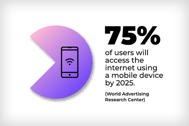
But fast-forward to 2021 and the story is wildly different.

Just as that rampant, all-conquering Spanish team would eventually stutter and stall, so mobile substituted the desktop search. Now 55.5% of our searches are taking place on mobile phones.

It’s a dominance that will only grow. And that means keeping pace with mobile design trends is something businesses of every stripe and sector must do. Non-responsive websites – those that offer sub-standard mobile experiences – will have customers bouncing away, like spacehoppers, to competitors. And it’s a good bet these visitors won’t be hopping back to you any time soon.

The good news is it’s not so difficult to instead deliver a site that attracts mobile traffic, delivers a knockout experience and keeps visitors returning again and again.

Ready to shine on the small screen?

Let’s look at some hot incoming (and then a few established) mobile design trends your website must have and can’t do without.

1. Dark Mode: the Bright Idea for Mobile Sites

Dark mode, a feature that uses background colours of black or shades of grey, inverts the usual white UI of websites and pages.

It’s an innovation that’s growing in popularity, with Android, Apple and Windows all facilitating an optional shift to the dark side.

A Book at Bedtime

For mobile sites it’s a neat function to offer. Here’s why. Dark mode is, somewhat counter-intuitively, ideal for low-light conditions. And with bedtime browsing overwhelmingly experienced on mobile and tablet, it’s easy to see why it’s a winner. Dark mode conserves battery life too and, for enhanced UX, it reduces users’ eye strain. It also looks cool and plays into another trend: personalisation.

Of course, achieving a dark mode version of a website isn’t just a case of mellowing everything that’s bright. This design task calls for balance and subtlety.

At Hookson, as part of our website design services, we can develop a dark mode for your new or existing site.

2. Round the Corner

Expect to see more and more images and assets shedding sharp angles and instead showing off their curves. Hardware across iOS and Android mobiles have dropped right angles. Now watch the stuff on screen – images and graphics, design elements and backgrounds – heading the same way.

Keeping pace with mobile design trends is something businesses of every stripe and sector have to do.

With this direction of travel, it pays to deliver an outstanding mobile experience

3. Vocal Majority?

Voice search isn’t a new innovation, but it’s one that’s likely to shout louder across 2021. Personal assistants like Alexa and Google Nest have made voice search mainstream and, well, less weird. For mobile browsers the notion of bypassing the screen altogether is tantalising. And it’s something website designers will be more actively considering.

4. Reality Biting

With more Augmented and Virtual Reality gadgets emerging – wearables and headphones, for example – it’s a good bet that AR/VR will continue encroaching on diverse industries.

Immersive experiences are on the way in sectors from retail and fashion to autos and e-commerce. Away from shopping, AR/VR will continue imposing on the worlds of education, medicine and entertainment. Where the mobile steps in will be via apps that enable everything from a see-before-you-commit tattoo to the training of medical students.

5. A New Dimension

In 2021 it’s likely that 3D elements will continue rising in popularity. And with mobile screens easily handling HD, use of 3D graphics across websites will make for a more immersive experience. It’s a move that will complement also the uptake in AR/VR devices and apps.

6. Dialled-Down Design

Perhaps surprisingly, given all the cool stuff we’ve looked at, one trend to be aware of is minimalism in design. Of course, less is more is an approach that’s nothing new, but it looks hot to trot in 2021.

Some Welcome Calm

Complex products and services benefit especially well from this design solution. On mobile in particular it provides a vista that’s a joy to experience. And, more generally, after 2020 who wouldn’t welcome a bit of calm? Minimalism though doesn’t mean shedding the terrific innovations and solutions we’re touching upon. A balance is achievable.

7. A Thumbs-up to Thumb-Down?

With mobiles increasing in physical size, the world’s thumbs are finding it difficult to negotiate the glassy expanse and reach the screen’s summit. In response, developers may begin positioning key navigation objects at the base of pages and apps. It’s thought a swipe upwards could also make more options accessible.

8. Time to Believe in Device-Agnosticism

In 2020, Statista revealed the average number of connected devices a person has access to in the UK. The figure? 9.16. For mobile design, this indicates that designers will begin progressing the mobile-first philosophy into a device-agnostic approach. One that concentrates on a seamless user journey across these multiple devices. That’s good news for thoughtful design, UI and UX.

The smaller screens of mobiles and tablets can absolutely be home to big-impact features. Animations, infographics, motion film, video and effects all work beautifully.

9. Swish New Swiping

Of all the mobile design trends in this post, this might be our favourite. One of the joys of mobile browsing is the swipe. It’s physical. Tactile. And there’s just something addictive about zinging pages back and forth. So the swipe is likely to become more engaging and memorable in 2021, maybe with animations and effects reflecting something core about a business.

To an extent, we’ve all seen this of course in applications where a page-turn on screen mimics the feel of a page-turn on, well, an actual book. Going further, it will be interesting to watch designers connecting the swipe to their clients’ businesses in more direct ways.

10. Neumorphism. Say, What?

The smaller screens of mobiles and tablets can absolutely be home to big-impact features. Animations, infographics, motion film, video and effects all work beautifully on mobile.

Special Effects

Right now, one hot word in this area is neuomorphism. It’s a UI design style that uses shadows to achieve a stunning floating effect on website elements. Parallax is another effect that at Hookson we’ve been successfully applying to websites. This innovation creates a 3D effect on scroll, resulting in visuals particularly suited to businesses concentrated in the arts and auction-house fields.

If you’re looking for a website that harnesses these and other striking effects, we’d love to chat further.

Tried and Trusted Tips

So, with a phoneful of incoming mobile trends wrapped up, here are some tried and trusted fundamentals. These tips are solid; dependable old-hands that sit effortlessly alongside our run-down of new entries.

Design For Dimensions

Responsive design should always take into account the reduced screen sizes that characterise mobiles and tablets. That translates into making design choices aimed squarely at end users. Here are some fundamentals:

Bigger Buttons

Great mobile sites are those that function without users feeling compelled to pinch at their screen and zoom into details. Using large buttons might seem like small beer, but the slicker your clicks, the more engaging and user-friendly your website will be.

A Pointer About Text

Similarly, text should be large enough for a comfortable read, and laid out thoughtfully – no swiping left and right.

See the Menu

With space at a premium, menus for mobiles and tablets have to work extra hard and be extra smart. Simplicity is key here, with menu items often exploiting drop-down categories from a broader term.

Hookson’s responsive website for Gorringe’s auctioneers offers a hamburger button (the friendly device denoted by three or four stacked horizontal lines). From here, it’s easy to access numerous departments, services and categories. It’s a clutter-free solution for a business with lots on offer.

Thoughtful, customer-pleasing UX is a feature of all Hookson website designs

Assist the Search

Supplementing even thoughtfully-designed menus with a dedicated search tool is a must. A well-designed search feature enables users to cut to the chase and find information, items, services – anything your business offers – in a flash. That improves UX and keeps visitors engaged and on your website. Going the extra mile, make it easier to enter text in fields and forms via use of auto-fill and even voice-activated input.

White Space: Where Less is More

Site aesthetics matter. Backing up the trend for minimalism, use of white space gives mobile sites, where space is forever a concern, room to breathe. Now, when contrasted with elements like shapes and opposing colours, illustrations and images, the result is an engaging website that’s a pleasure to explore.

Keep on Top of Your Call-To-Action

A call-to-action is the classic marketing staple that asks consumers to do something. Maybe something noble: Dig for Victory. Something challenging: Think Different. Or perhaps something abstract: Taste the Rainbow. Every website should have a CTA, and for most businesses it’s likely to be less Keep Calm and Carry On and more Click Here to Sign up.

Short and Sweet

On mobile, calls-to-action can be a particular challenge. That’s thanks to our old friend lack of space. So, on phones and tablets, keep CTAs short, sweet and ‘above the fold’ – in other words, in the upper half of your site where visitors can see them without the need to scroll. Placing them in the centre assists stand-out too.

Ensure Lightning-Fast Page Loads

When unoptimised images and graphics, numerous plug-ins and too many redirects weigh pages down, the result is a slow load. And by slow, we’re talking anything above three seconds. Google research showed that the risk of a bounce shot up 90% when a page load time increased from one to five seconds. Waiting up to ten seconds? Your customers won’t; that bounce rate whizzes up to 123%.

Want to avoid becoming a statistic? Then think:

Mobile-First

At Hookson, our mobile-first design philosophy is one that Google champions. It’s an approach that values intuition over complexity and focuses on the content that’s most important to your business. Designing mobile-first ensures mobile and desktop pages are lean and agile from day one. That’s why our WordPress builds utilise responsive themes that keep pages flying without losing any of the functionality.